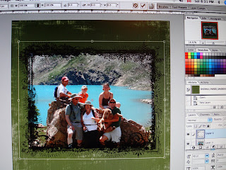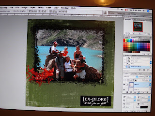
If you're new to digital scrapbooking, I've compiled the steps to make a basic layout such as this one for you.
All of the elements I used are free downloads from Rhonna Farrer and Jessica Sprague.
First, open a file that is the size you'd like to work in, I use 12 x 12 because that's the size I usually have albums for and a nice big canvas to work on. Make sure to save it here so that if anything happens, you'll at least have the benefit of save updates.
Next, open your background paper and drag it onto your document.
Open your picture and place it on your layout, sizing it accordingly (I usually size mine to about 5 x 7 in advance so it's not a huge file).
Next, open the frame and size and rotate it using free transform, in your edit pull down menu. A note for those new to designing, if you hold down the shift key, you will maintain the elements proper proportions. This way, nothing looks flattened or squished.

Next, open the explore text and drag it onto your layout. This time, try sizing it by going to edit and then transform and then scale.
Open the bird file and drag to layout, size using either of the previously mentioned methods.

Most of the time, I like to try and place elements on my layout in the order I'd like them to appear, however, that doesn't always work... I always think of elements I'd like to add or change my mind, which is a part of the creative process. This time, I thought the background looked a little boring so I added a transparency.
To do this, open the transparency and drag it to your layout. Move it behind all of the other elements by choosing the layer it is in from your layers palette and click on it with your cursor, hold it down and drag the layer directly above of your first layer (your background paper). This way, all of the other elements will be above the transparency, except the background paper.
I changed the opacity of the transparency to 28% using the opacity slider located above the layers palette.
A few last minute things and we're done. I moved the explore text and added a ribbon to finish things off, and then hit save. Voila! Done.
Now save your file. If you won't be altering it, ever again, save it as a jpg, this will flatten all of the layers so anything placed in the file will be unmoveable in the future. Otherwise, if you're in photoshop a psd (or gif in most photo editing software) file will allow you to come back and move elements, change layers, etc.
So, happy digi scrappin'!

2 comments:
Oooh, welcome to the dark side! hee hee kidding! You did great Kelly, keep it up!
great screen shots and tutorial! I love the layout!
veronica
Post a Comment